I need help now
Speed · proximity · available care
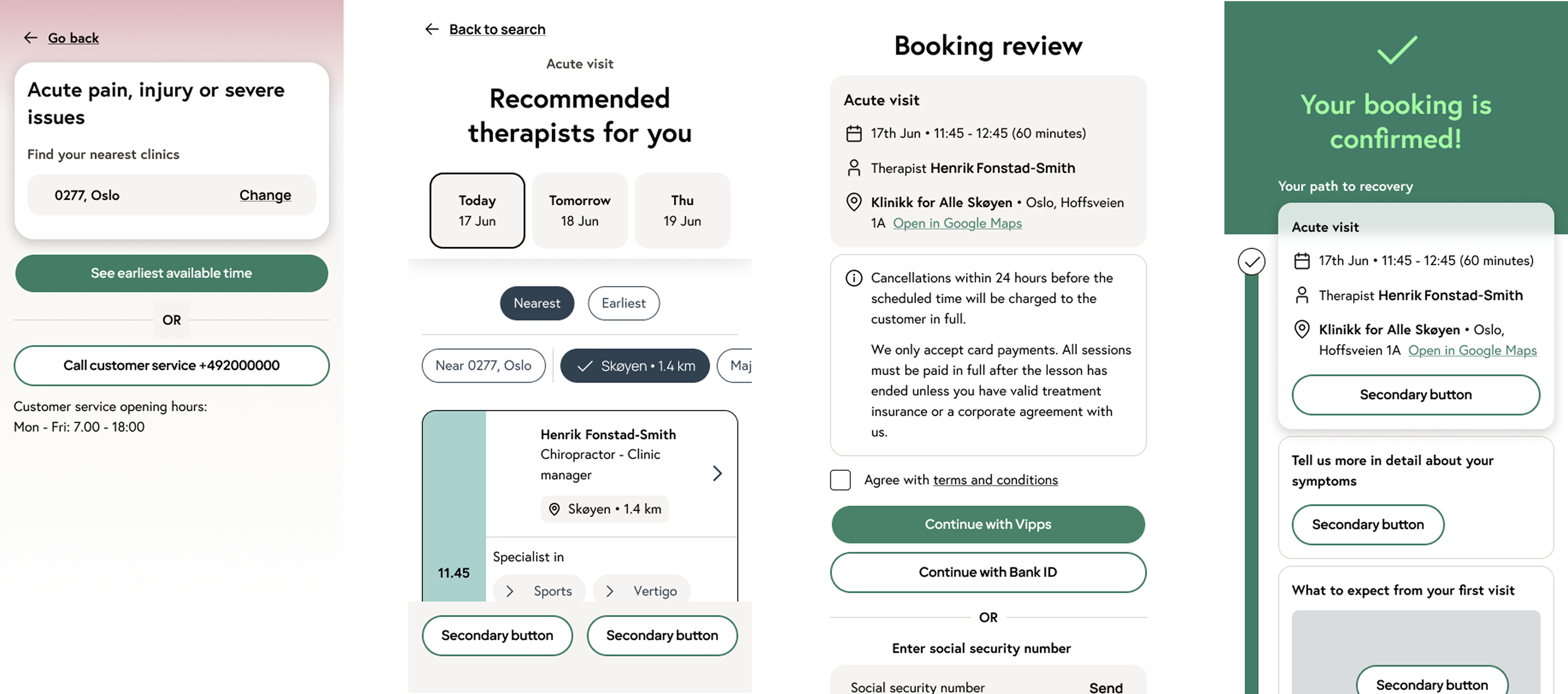
Scroll sideways to explore the flow
Redesigning the digital journey around what patients actually know — their symptoms, needs and location — rather than expecting them to understand which professional, service or clinic they should choose.
01
Finding care shouldn’t require
understanding the healthcare system
02
Responsibilities
I worked across the redesign from discovery and research through concept development, interaction design, prototyping and user testing.
03
Understanding where confidence breaks down
We combined interviews, clinic visits, analytics, an audit of the existing experience and competitor benchmarking.
04
The biggest barriers appeared before the appointment itself
People often explored care through symptoms rather than knowing which service or professional they needed.
Choosing between professionals was not always straightforward. People needed clearer signals about expertise and why someone might be right for them.
People wanted to understand what they were booking and what it would cost before committing.
Managing and continuing care needed to feel connected rather than fragmented across different parts of the experience.
05
From symptoms to the right care
The central idea was to use what patients already know — symptoms, needs and location — to guide them toward what they often don’t: the right service, professional and clinic.
Different needs, different paths
We designed the experience around different situations rather than forcing everyone through the same journey.
Speed · proximity · available care
Scroll sideways to explore the flow
Guidance · explanation · confidence
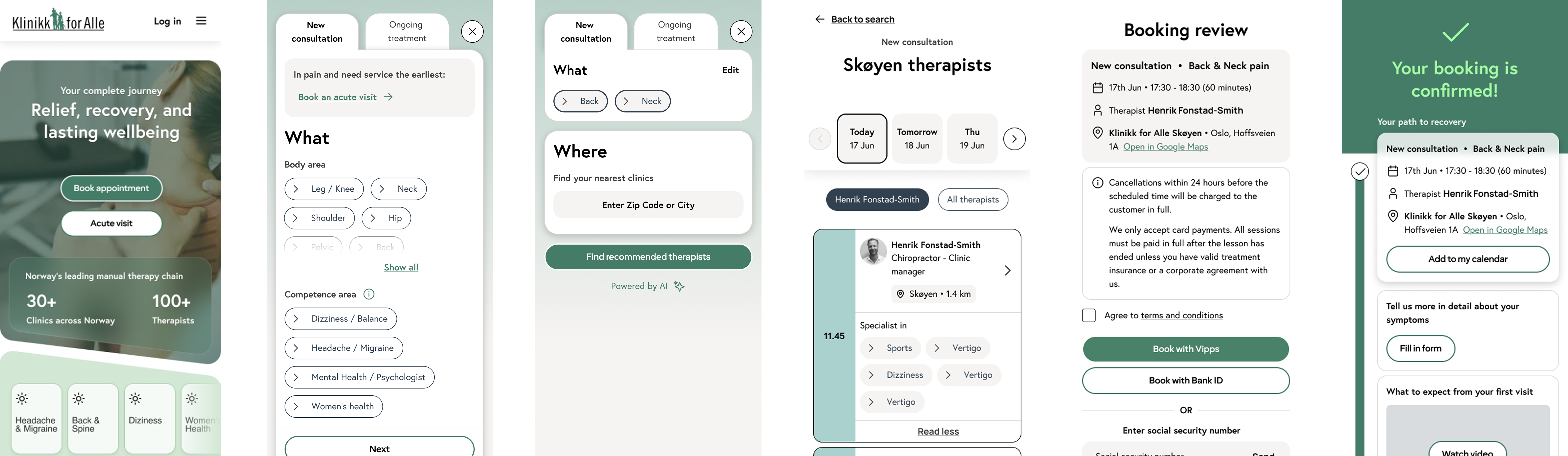
Scroll sideways to explore the flow
Continuity · familiar care · easy rebooking
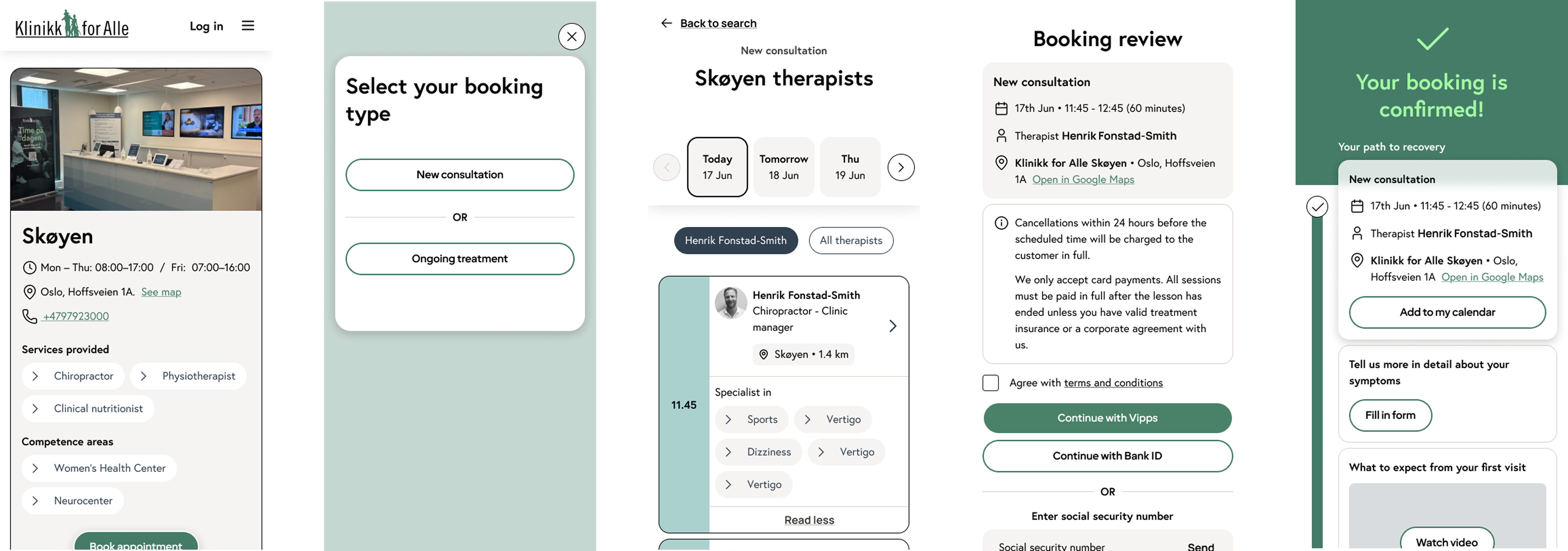
Scroll sideways to explore the flow
06
The concept was tested with six participants to understand not only whether people could complete the journey, but whether they felt confident that they were choosing the right care.
“Very easy to read… this felt very welcoming and well thought through.”
The concept gave patients a clearer path from “something is wrong” to confidently choosing the right care.